Setophaga petechia (Yellow Warbler)
Visual overview of genome assembly metrics
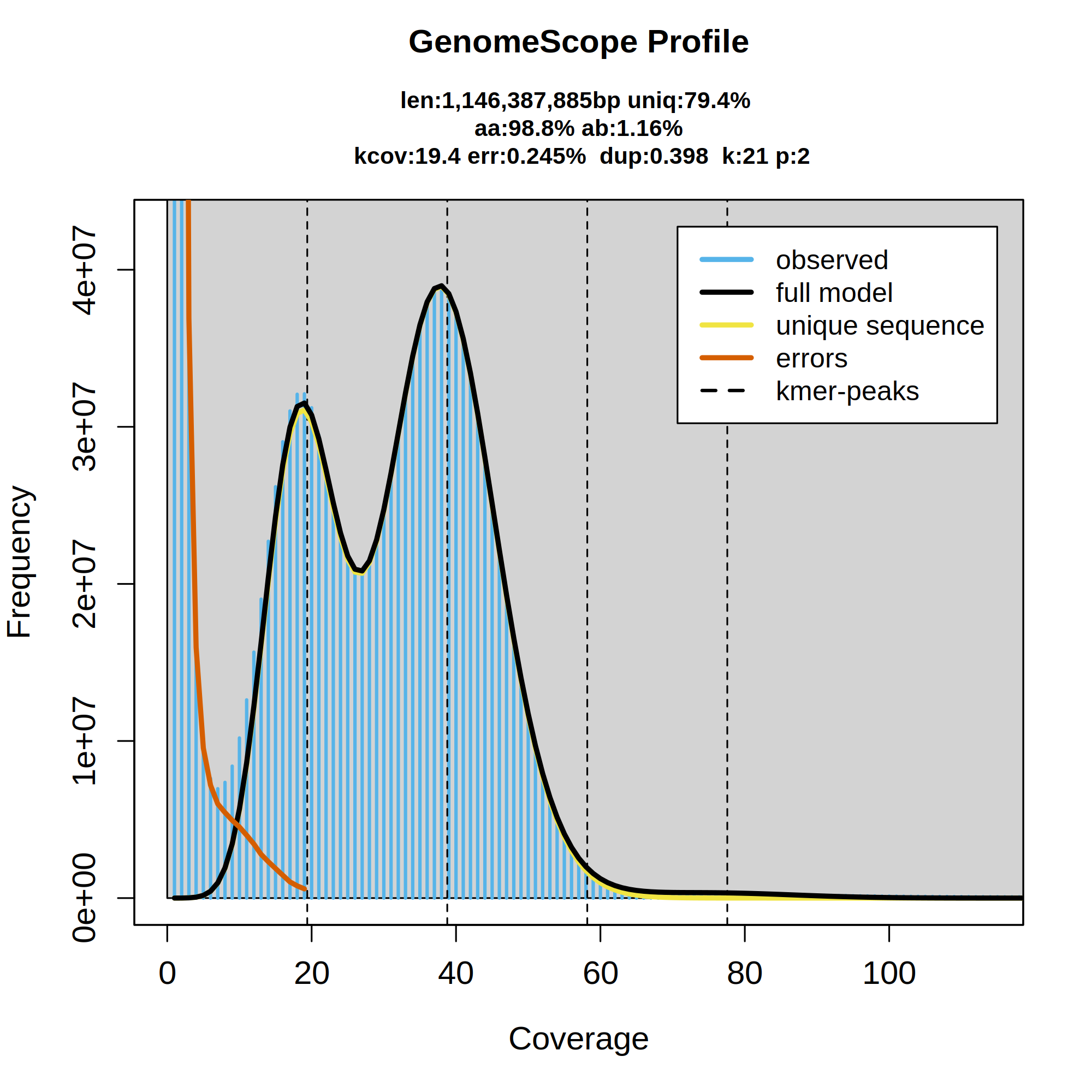
Kmer spectra output generated from PacBio HiFi data without adapters using GenomScope2.0. The bimodal pattern observed corresponds to a diploid genome. K-mers covered at lower coverage and lower frequency correspond to differences between haplotypes, whereas the higher coverage and higher frequency k-mers correspond to the similarities between haplotypes.
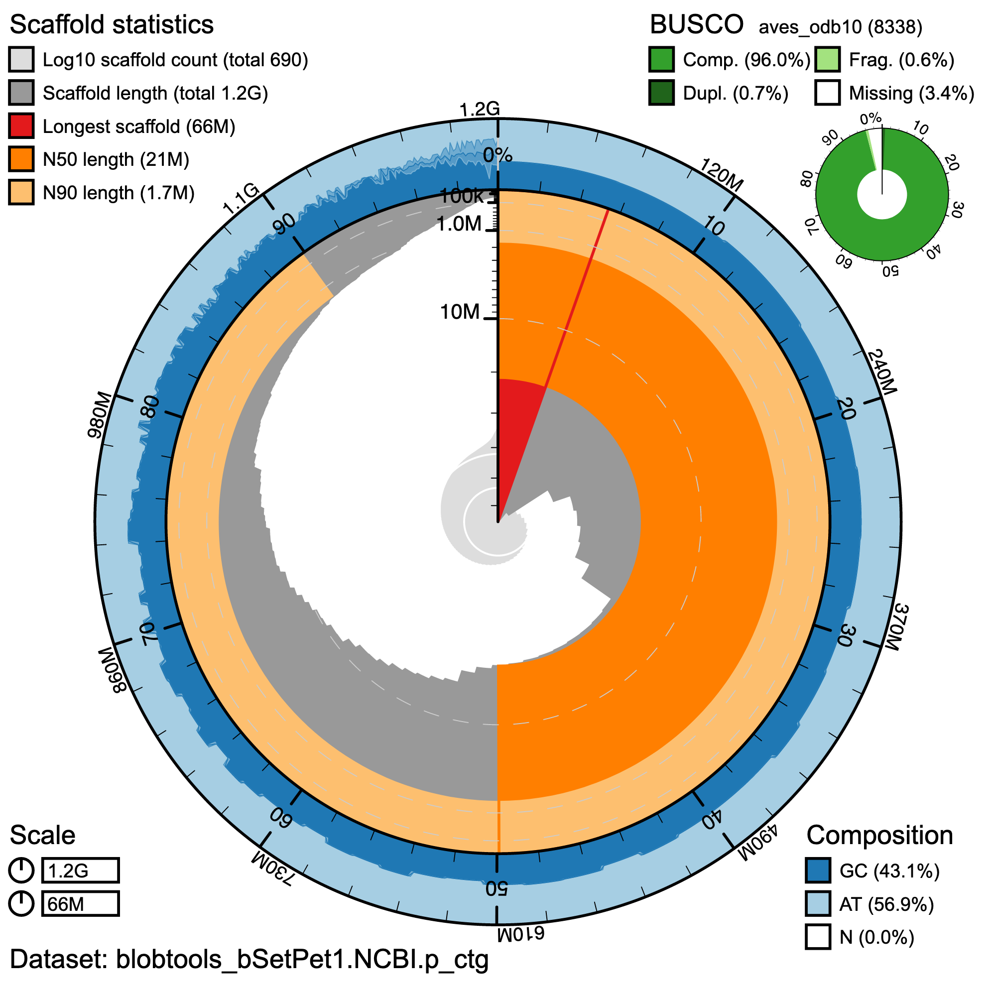
BlobToolKit Snail plot showing a graphical representation of the quality metrics presented in for the Setophaga petechia primary assembly (bSetPet1.0.p). The plot circle represents the full size of the assembly. From the inside-out, the central plot covers scaffold and lengthrelated metrics. The central light gray spiral shows the cumulative scaffold count with a white line at each order of magnitude. The red line represents the size of the longest scaffold; all other scaffolds are arranged in size-order moving clockwise around the plot and drawn in gray starting from the outside of the central plot. Dark and light orange arcs show the scaffold N50 and scaffold N90 values. The outer light and dark blue ring show the mean, maximum, and minimum GC versus AT content at 0.1% intervals (Challis et al. 2020).
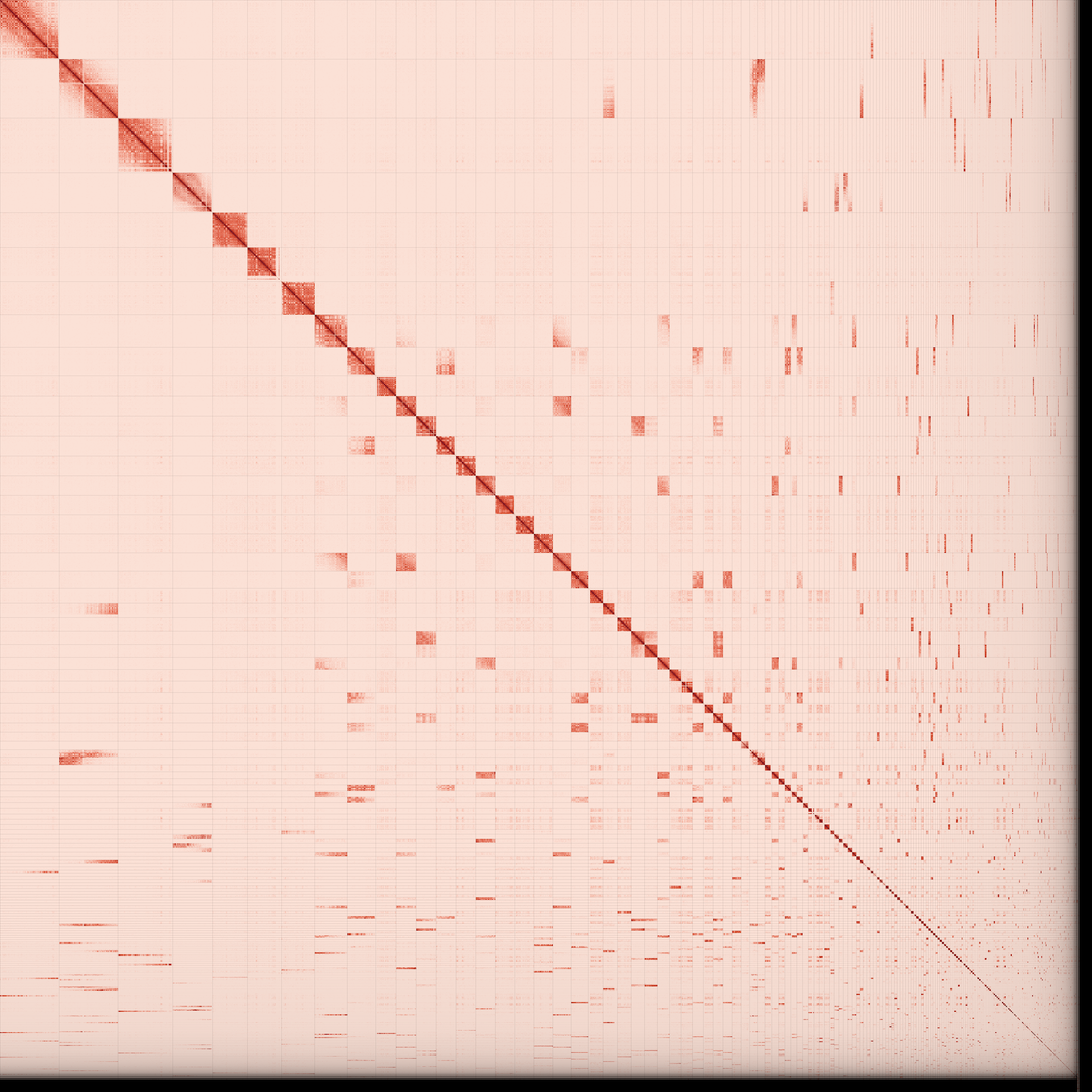
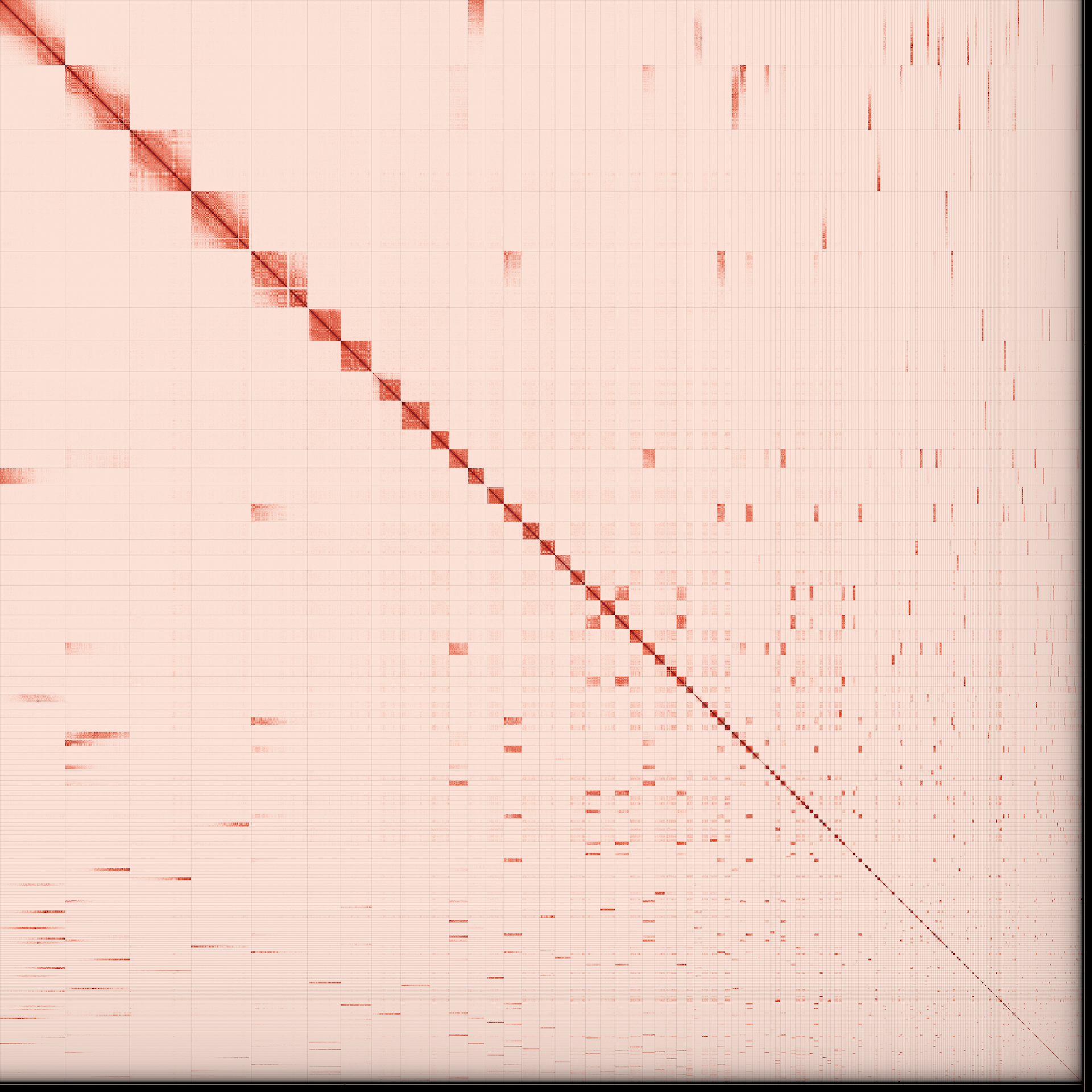
Omni-C contact map for the primary genome assembly generated with PretextSnapshot. Omni-C contact maps translate proximity of genomic regions in 3D space to contiguous linear organization. Each cell in the contact map corresponds to sequencing data supporting the linkage (or join) between 2 such regions. Scaffolds are separated by black lines and higher density corresponds to higher levels of fragmentation.
Authors
Whitney L E Tsai, Merly Escalona, Kimball L Garrett, Ryan S Terrill, Ruta Sahasrabudhe, Oanh Nguyen, Eric Beraut, William Seligmann, Colin W Fairbairn, Ryan J Harrigan, John E McCormack, Michael E Alfaro, Thomas B Smith, Rachael A Bay